Saturday, 7 May 2016

Logo Investigation

1. Warner Bros Pictures
What did it used to be, what is it now, why did they use it and why did they change it and what has it come to symbolise

Though the Warner Bros logo has varied over time, there is one consistent object that it is based around and that is a shield. The original logo has transitioned through a multitude of logos. There are 13 main logos as well as 200+ variations of these logos that were customised to reflect the theme of the film.

Above: Warner Brothers Logo 1923
In 1923, Warner Brothers released a film with their first logo. It was nicknamed the 'Brain Shield' and the top half of the shield included a photograph of the exterior of the Warner Brother's studio that is located in Burbank, California. The bottom half was inclusive of the famous W-B initials. The shield was never given a solid meaning, however I feel like it could be symbolic of Warner Brothers showing their strength and how they are determined to thrive in the film industry. The shield is a symbol of protection meaning no other companies could takeover.


In 1929, sound was introduced to film and to show
that their films were now accompanied by sound Warner Brother's partnered with Vitaphone and created a logo that acknowledged them. They still included the shield but it had evolved. The shield no longer contained the image of the studio and instead, the WB initials completely occupied the space of the shield. The shield stayed centred in the logo and more words were added for audiences to also acknowledge Vitaphone. 


The first appearance of colour in the Warner Brother's logo occurred around 1940. The famous blend of red and blue hues is accompanied by a shining gold shield that is a reflection of the companies characteristics. It represents wealth, authority and power. Warner Brother's is on of the oldest and most influential American production companies behind Paramount Pictures and Universal Studios.


Though there are many variations of the Warner Brothers logo, there are three main variations that have affected the main idea of the logo. These came as results of changes in ownerships or partnerships that Warner Brothers have undergone. 

The first change of ownership that affected the logo happened in 1969 as a result of Jack L. Warner selling his controlling interest of the company to Seven Arts Productions. For the first time since the establishment of Warner Brothers, the famous WB initials were no where to be seen. Instead there was a W7 in the centre of the shield that represented the merge between Warner Brothers and Seven Arts. 


Two years later, the company was brought by Kinney National Company who thought it would be a good decision to remove 'Seven Arts' from the companies name and return the logo to its original state. They wanted the logo to resemble something of a gas station sign. The letters were gold and encrusted on a crimson shield. They added their company name on a strip placed on the lower half of the shield. All this was done in an attempt to divert from the historical record of the logo.


In 1972, Saul Bass was hired to revamp Warner Brothers company. Known for his graphic design, Bass produced the above logo. To many people of the 80's this logo was actually compared to the a Nazi like design and was disapproved of by many. However, this logo is used for a few modern day films such as Magic Mike and 'Argo'.

The 2016 logo is a combination of old logos mixed into one. the basic idea of the shield has been kept constant as well as the red, blue and gold theme. The Warner Brothers initials are still the main parts of the logo and the band that contains the film companies title is centred on the shield. This is similar to the Kinney National companies idea of having their name on a band in the lower half of the shield. The distinctive logo is globally recognised due to its colour and unchangeable inclusion of a shield. 


2. Dreamworks 

Many film companies have started from humble beginnings and grown into something great. DreamWorks however, was created by many great names in the film industry which resulted in sucess from the start. In 1994, Steven Spielberg, Jeffrey Katzenberg and David Geffen came together to create the company known as DreamWorks. One of the main reasons for DreamWorks' success is the logo that is globally recognised as belonging to them. Both Spielberg and Katzenberg are creative with their sense of animation. Katzenberg is chairman for Disney while Spielberg has created films such as E.T, Jaws and Jurassic Park.

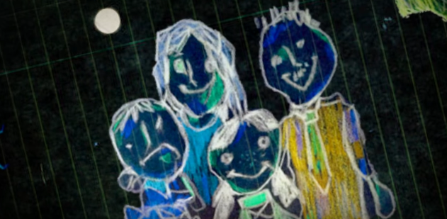
Robert Hunt with his son.

The 'Boy on the Moon' logo was first pitched by Steven Spielberg. He had wanted to create a logo that could capture the essence of Hollywoods 'Golden Age'. At first, Spielberg had wanted to make the image computer generated but they ended up commissioning artist Robert Hunt to hand draw the image. Originally, Spielberg had wanted to use a man sitting on a crescent moon but after Hunt used his son as a model, all three of the moguls came to the conclusion that it would be better to have the man become a boy. 


In 1995, the logo was recreated to involve some clouds. It was then known as the 'Cloud Cover' The clouds added a nostalgic and idyllic effect to the logo while the child fishing on the moon was effective in speaking to the inner child in everyone. The logo was a representative of DreamWorks' films, they were created as something not confined to one place but instead they would create fairy tale films that took place in foreign places.


Shown below is the most recent 2016 DreamWorks logo. As anyone can see, it has brightened up and become a lot more colourful. Again, it shows the idyllic boy on the moon in the centre of the screen and this has not and most likely will not change for a long time. The bold words however have been changed and this time are not blue but an array of different colours. This targets children as it shows their company as playful and child orientated. Each letter is given a different colour that makes the logo stand out from the blue and white background.


3. Paramount Pictures

Paramount Pictures was first established in 1912. It started off small and has since then grown to become one of the most influential film companies to date. Paramount Pictures has become globally recognisable due to its distinctive mountain range poking through a bed of clouds. Brand recognition is important for any company and for audiences who watch any film created by Paramount Pictures, the logo is an important part of the film. It is not often that Paramount will change any aspect of their logo to relate to certain film themes but there are some cases in which this will happen. 

The first logo is rumoured to have been doodled on a napkin in 1914.  It was a drawing of a star-crested mountain. The now famous 'Magic Mountain' is an idealised picture of Ben Lomand Mountain in Utah. The mountain is said to have held a great significance to William Wadsworth Hodkinson, the creator of Paramount Pictures, as the mountain he remembers seeing as a child.                                                                                                                                                    The image of a mountain is is strong. It alludes to a certain empowerment and confidence. Considering Paramount has been around for over a century, it is the perfect image for the worlds second largest film company.
In 1952, the second logo was redesigned as a matte painting done by the studios head painter, Jan Domela. They changed to this logo from the ones created by film techniques because they believed it was time for a change.                                                                                                   The 24 stars surrounding the mountain are just as significant as the mountain itself. They represented the amount of actors and actresses working for Paramount Pictures at the time. Depending on the amount of actors signed to work with Paramount, the stars would either grow or shrink in size. 

The third recreation of the logo was created in 1987 and since then, there have been no drastic changes. Again, the format of the image changed and was created as a computer generated image as opposed to the previous matte painting. With technology improving, they were able to create an image with much better graphics as they were introduced to animation.

The stars had previously remained static but now would appear to fly toward the mountain before settling in their original position. This is done so that the focus is then on the mountain's peek - a symbol of strength and power.

The Importance of a Film Logo:

From this investigation what I've learnt is that there is a certain importance to having the main elements of your logo in the centre of the screen. It means that all attention is focussed on the image in the middle. If the image is simple then it will eventually become recognisable. For a lot of the film companies it isn't that they are easy to remember but more so that they have been around for generations to see and people have grown up just knowing which film is made by which company. All of the logos have the name of their company, although they could just leave this out as they have distinctive images that present the logo, their names are always clearly and boldly presented either directly above, beneath or centred on the main image. They also have one specific logo that has been constant since the companies logo was created and any attempt to alter this has resulted in its return. 

Saturday, 30 April 2016

Opening Sequences


How is the sequence engaging and how does it conform to traditional Thriller codes and conventions?

1. Buried - 2010


Right from the beginning, the opening sequence of the action thriller is enticing to audience due it's use of a non-diegetic backing track. The track is low and creates an eerie and suspenseful feeling. It begins with a quiet cello sound that is soon accompanied by trombones and even a tuba. The sound creates and intense feeling and in some ways it can be compared to that of the 'Jaws' theme song. In Jaws it was used to bring the uneasy feeling of danger and distress and here it foreshadows the coming danger. The music is intense due to the rise and fall of sounds that never reach a high point. They grow and grow and grow and then turn somber and quiet but it isn't long before the sounds begin to heighten again. Using an intense backing track for the opening scene in a Thriller film sets up the correct atmosphere that pulls an audience into another world for a film. 


Thriller movies often use their title sequences to foreshadow events that are to come in the film. 'Buried' (As one can assume by the title) is about something or someone being buried. The way in which the titles are presented is done cleverly as if they are being buried underground and we as the audience are following as we get deeper and deeper underground. The words scroll upward from the bottom of the screen, lingering in the middle before the letters are messed up and continue to scroll away from the screen. They move upward which hints to the audience that we are going further down the hole, getting deeper into the earth. In many thriller films, we see in the opening sequence how the film will go from big picture to little picture and here we see how the film will take place by dragging the audience under. When you bury something, you are piling pieces of dirt onto pieces of dirt. In a sense, the letters are like those scattered pieces of dirt and they relate to an upset in the equilibrium. 


Another way in which the 'Buried' opening sequence conforms to the Thriller conventions and codes is the dark colour scheme. The effect of black space is to create a feeling of unknown and in this case, it represents the feeling of being confined. While black space can be used to show that there is a great unknown, it can also create a 'boxed in' effect where the audience feel as though they have no place to escape. The first two minutes of the film are a complete black screen which replicates the feeling of being in a coffin. And that is also what Jorge Calvo, creator of the sequence, set out to do here.

Calvo says that his title sequence was very much influenced by that of Saul Bass who created sequences using 2D graphics. Calvo says that he tried to take it 3D but found the 'dry 2D-ish thing' to be more 'depressing'. 


Left: Saul Bass work on 'Vertigo'            Right: Jorge Calvo work on 'Buried'

Both graphics foreshadow events in the films. For example, the theme of spiralling personalities occurs in 'Vertigo' while being capsuled in darkness, buried in  a pit of nothingness is clearly seen in the film 'Buried'.

2. Splice - 2010

The first image an audience is presented with is what seems to be a piece of skin. The patterns on the flesh resemble that on a magnified part of the body. The entire screen seems to be tinted green. The colour green is often used to represent something gross and inhuman which would be perfect in a film that already seems to be focussed on the human body. It shows that the film will be great for anybody who can stomach it. Because of this, its target audience would probably for audiences 16-55.


The shot zooms in as we travel along this body part where it eventually seems to turn into something inhuman. The microscopic patterns now seem to resemble scales. Again, the camera continues its journey, doing a 360 spin before again zooming in on another part of this unknown object. As seen in the screenshot to the right, there is an abundance of small spheres scattered across the screen. In the next few seconds of the sequence, these seem to be enlarged. They look like globular molecules that would be found in the body. 

The accompaniment of non-diegetic sounds creates an atmosphere of suspense and fear. The high pitched ringing is something you would usually find in a horror movie as it alludes to something dangerous that is to come. There are a few high piano notes that are played along with some type of brass instrument to create the suspenseful tone. 


The main actors name seems to be scrawled across the same surface we saw in the beginning of the sequence. This is significant as it represents the person who is most important to the film. The following names seem to be burnt into what looks like the surface of a persons flesh. 


As the sequence progresses, the audience is taken deeper and deeper into the body. This shows that the audience will be taken on a journey that is not just surface level. The sequence takes us so much deeper than the surface, exploring the depths of the body. From flesh, to veins, to organs which to some is pretty gross but it is exactly what the director has wanted to happen. The green hue is significant to explain some sort of decay that will happen and the title itself alludes to the different parts of the body. To splice is to cut and it is obvious that this film isn't for the weak stomached.


The title isn't introduced until the end of the sequence and by then, the camera has zoomed right out onto what seems like a persons back. As the title begins to appear, the non-diegetic sounds intensify as an orchestra plays to build suspense to a loud crescendo which would probably cause some audience members to hide behind their hands. 

The film is gruesome and because of that, it could be considered a horror but the music that is used to create suspense and the design of the titles allude to a hybrid film. Thriller, Horror and Sci-Fi are all combined genres in this film. 


3. Orphan - 2009
The opening sequence for the film Orphan doesn't involve any real images. Instead it focuses on drawings that pull an audience into the mind of a young and disturbed girl. Immediately, an audience is hooked by the non-diegtic sound that creates an eerie atmosphere. There are brass instruments accompanied by music that one may hear in an old school church, the sounds are low and hardly harmonious. The colour palette is also very, very dull. What's the significance of this? The audience may ask.. their questions will obviously be answered when they see a photo of what looks like a brother and his younger sister. 


The camera pans across the table to scan over the photos and various bits paper as it slowly reveals the theme of the movie - Family. This conforms to the thriller convention of foreshadowing the movies theme without giving too much information away. There is a brother and sister and we eventually see a colourful and happy family.


The sepia edited filter will let the audience know that the film or events had taken place years ago and out of nowhere we get this coloured drawing. Drawings are used in film as a representation of what is going on in someone's head. A persons creativity is how they would get out their true thoughts. 


Thrillers will often use some form of the main characters talent to showcase how they will effect the movie. For example, this drawing puts us in the head of the young girl. Yes, it is a happy family.. but in less than three seconds, the drawing is altered and the effect turns from sepia to negative, making the family now surrounded by black. 


Innocence in thriller films is often used to cover up a darkness within a specific character, especially in psychological thrillers. Here we have the perfect example of an innocent character who is mentally corrupt. The images we see begin innocent but as the colours flash, we can see how she really thinks. This shows that the film wouldn't be suitable for children despite its happy beginnings. I believe this film would be for audiences aged 16+ as anyone younger would be too scared and those of any age above could always be interested in a good thriller. 


In one sense however, this opening sequence subverts the convention of having a consistent dull colour scheme. Many of the drawings are bright and even with the change in colours, black being the encompassing one, the artwork still seems to glow with vibrant blues, oranges and pinks. The colours are representative of a wild and vivid imagination that leads to the characters disruptive behaviour later on in the film.


Sunday, 10 April 2016

Planning for Preliminary Task 2

Atychiphobia (The Fear of Failure)

The concept of our film was to have a girl being put into the spotlight but being encompassed by fear. A fear of failure that will eventually relate to her ultimate downfall as she is captured by her own fear of not succeeding. The title of our film was chosen by my team mate, Brooke. She researched different phobias to find one that would best fit into the idea of our film.

For this project, I wrote up the concept of the film and the conventions that we were aiming to include. 


Conventions:


Character: Main character will be a nervous girl, constantly displaying a miserable attitude, dancer/or singer, dressed in dark clothing - but not black navy? self doubt and conflict within her to know if she is good enough or not


Villain that lurks in the shadows - Face will be hardly seen, kept hidden til final shots


Close up shots: Can create anxiety and confrontation. Show detail. Example: Sweat on the girls face, body movement


Eerie and suspenseful atmosphere brought by both non diegetic and diegetic sound. Diegetic sound will be most important because it will let the audience hear what the actors hear - examples: heavy breathing of villain behind the scenes and dancer, music that goes with dance - Non-diegetic sound - crash - at the end of sequence before title flashes across the screen to show that something significant to the film has begun


Mirror - Girl stares into the mirror and it reflects how she feels inside and who she really is

Cliffhanger - Person in the mirror is girl herself who later becomes important to the film's plot


Non diegetic music - Light, eerie sound that creates a ballet like sound, string instruments, slow paced

I came up with the plot/storyline of our film and both Brooke and I refined the ideas to create what we believed would be a thrilling film. 


Sasha Peters is an aspiring dancer but she seems to be consumed with fear. While onstage, she is an emacculate dancer who has the ability to mask all her fear with dance. Sasha is auditioning for a place at a prestigious dance school overseas. But her fear of failure becomes her worst enemy.


The opening will begin with a sequence of different scenes that will later be important in the film - The sanctuary (stage and audience)  backstage, bathroom, pathway - high angles, low angles, panning
Main Character - Sasha 1 - walking toward the sanctuary where her sanctuary will be - long shot, no camera movement
She’ll be on the phone, close up when she says “But what if I fail?”
Cuts to black screen where the title will be presented
When the title fades, we cut to a mid shot of Sasha 1 behind a curtain
Close ups on certain features of her - sweaty hands, face again
Voice heard in background “Sasha Peters? Sasha?”
Camera tracks her feet as she walks on stage
Camera Pans from in front of stage watching as she walks to the centre
Spotlights are placed directly on her and the judges are submersed in darkness
Camera shows Sasha 1’s point of view as she stands on stage looking out to the empty stadium - heavy breathing heard (diegetic)
P.O.V of Sasha 2 backstage as S1 introduces herself
camera pans around curtain and we see S2 backstage
Low angle shot of S1 dancing - Lights and music cuts off and everything goes black
Lights in bathroom flicker on/off - effects edited over the top
Shot 1 - Side on
Shot 2 - Over the shoulder into the mirror as she looks up and sees her own face then fades to black
Bathroom scene mirror girl with jumper looks up and sees herself
cuts off --- credits

Originally, that is how we imagined the sequence to go but changes happened during the planning process and some of this got changed.

My team mate, Brooke van de Water, drew the storyboard and we both took part in piecing it together. 

I wrote the script while Brooke was in charge of the shot list.
Script can be viewed here.

For costumes, both Brooke and I came up with ideas. My part was dressing Sasha 2.

Sasha 2 is the alter ego of Sasha Peters. Her hair is going to be messy and informal in comparison to the tidy and formal style ballerina bun Sasha 1 will wear. The representation of scruffy hair, will show how disorientated and out of order Sasha 2 is. Her hair will usually cover her face which again relates to her hiding from her true self. 

Sasha 2 is a complete contrast to Sasha 1 and we see more of her toward the end. Her costume is a representation of the true self that lurks in the depths of a character. She clothes herself in darkness, shielding herself from any truth that may come her way. 


To match her scruffy hair, Sasha 2 will have a face smeared with black make up. This will represent disorder and distress. When a woman has significantly smudged make up, one would automatically assume something is wrong. And with Sasha 2, that is definitely the case.


The main item of clothing worn by Sasha is a dark green zip up sweatshirt. The dark green is significant as it represents a seething jealousy that lurks within the character who wears it. The darker the green is a representation of the darkness and distress that the character will face as a result of jealousy. The sweatshirt will have a hood as this adds to the idea of secrecy and hiding behind a mask. 


Commonly, people who lurk behind the shadows wear black to blend into the background. the black jeans will follow this convention and allow our actress (Sasha 2) to blend into the darkness and shadows behind the stage which represents her hiding her true self from her. 


Black converse shoes will be worn to represent the sneaky nature of Sasha 2 and her ability to change any given situation to allow her to get her way. The shoes are quiet with rubber soul. Rubber soles and souls will both bounce back despite what's going on in life. Sasha 2 is going to have fear consume her and her way of 'bouncing back' is to kidnap her own self. 


For filming, both Brooke and I shot different scenes and were both useful in directing the talent. Having multiple camera's made it easier for the both of us to shoot the same scene from different angles. 


Tuesday, 29 March 2016

Representation Codes & Conventions

Ethnicity and Social Status
Social class and ethnicity are key areas of representation in any film. In earlier films, people of colour were seen as well, bad. This is because racism was at its peak. Films represented black people as having the lowest level of status. They were defined by their skin colour and often completely dismissed by a dominant society of white people. Films used this as the 'normal' and black people were used in roles like slaves, thugs and maids.

However, in modern times, people of colour are still used to represent the lesser people in society, they way in which they are filmed and presented is often used for an audience to be sympathetic. For example, in this scene we are made to feel sympathy for the maid, Abeline. It begins with a close up shot that is very confronting. But, since the maid is not looking directly at the camera, we understand that it is her reaction to something being said. One of the most effective shots in this scene is the high angle shot we get that looks down on the little girl and soon enough, the maid herself. The high angle shots looking down on Abel and the small girl, represents how they are treated as the same. Abeline is looked at as a child and to an adult, she would be seen as nothing but a person who should receive instruction.

There are no significant transitions between shots and jump cuts are used to create the upsetting atmosphere. While Abel and the young girl talk, the camera shakes a little which represents the unstable environment that the both of them are living in. The only dialogue is between Abel and the child, the camera is close up on them which shows that they are having an intimate moment. The mise en scene of this particular scene shows a home filled with vibrant colours and clutter, it is a home of privilege. Abel wears a blue and white maid uniform, a huge contrast to the bright oranges and greens that surround her. The uniform represents how she has to conform to societies standards and live as nothing but a maid.

As she walks away, the camera tracks backward, following her. The effect this has shows that she has to take yet another journey but we do not know where exactly she is going because we don't see anything beyond the camera. The voice over is used to inform the audience of Abeline's true thoughts and feelings. It is a mixture of diegetic and non-diegetic sound that creates the sympathetic atmosphere. A slow paced tune played on the piano, screams of the young child and voice of Abeline plays with the audience's feelings.


Relationships 
Relationships in Hollywood are often represented as bent but not broken. In some cases they are completely broken but those pieces are often put together by someone or something else. To create intimacy and the feeling of being one, close up camera angles and mid two shots are often used. Intense relationship scenes also rely on non-diegtic sound to exaggerate the emotions. It is ironic that they have to exaggerate a relationship because it makes audience's want to relate to it. Not all couples are going to live up to televisions exciting standards, but to fulfil what they cannot have in real life, they indulge in tv and films.

An example of an exaggerated yet exciting relationship is the one between Toby Cavanaugh and Spencer Hastings in the show pretty little liars. Diegetic sound is used immediately to build a type of suspense and the camera pans up to see Spencer's face. When Toby's head pops up behind the window, it is accompanied by a non-diegetic screeching sound.  This creates an uneasy feeling for the audience. The filming of her reaction to a noise outside is done from outside a window, this creates a separation and the fact that her lover is on the outside shows that there may be secrets hidden within their relationship. (If you watch the series, you will know this is true.)

Iconography in this scene is also important as we see Toby giving his girlfriend flowers. Typically, red roses will be used to represent love. However, here Toby gives her a bouquet of white roses with pink at the tips. The pink could be seen as friendship but white roses are always associated with funerals. For anyone who watches the show, death is a huge theme and for Toby to be giving Spencer death flowers foreshadows his involvement in later events. As Toby follows Spencer, we change from a mid shot of him to his point of view shot. As the audience we are placed in Toby's footsteps. The shakiness of the camera brings an uneasiness. This scene seems to subvert the modernised idea of a healthy, loving relationship and Toby seems to be more of a stalker than a boyfriend.


Identity

In any film, identity is always a key theme. Identity can be regional (relating to origins of the person) or a battling conflict within the person themselves. Camera tricks are often used to portray identities as an internal struggle. It'll often shake and tilt to disorientate the audience. Internal identity is used more often in film as it creates an environment that the audience can pull their own self into. In many films, identity is the main theme but it is only brought out by the character taking a completely different journey. Identity is often seen in mirrors as these create a 'window' into another world where the person is able to see their true self, their soul.

In this scene from the 2010 film 'Black Swan' we have an over the shoulder shot of the main character   in front of a mirror. It is important to note that her body is directly on the line of thirds in the right hand of the screen. The back of her body is blurred and our eyes directly move to her body that is much more focussed. The multiple images of her in the mirror show that she has more than one personality and that even she doesn't know how to separate them from each other. All sound is dietetic and even so, there is hardly any sound at all. The eerie silence creates an uncomfortable atmosphere, the harsh tone of the woman dressing the ballerina doesn't bring any comfort either. This convention is used in films to show the audience how upsetting no sound can be and in the case of this, the empty silence is a representation of the empty identity that this woman has to find.

The camera's pan around the back of the ballerina's neck creates the effect of two different sides. In a sense, we can think of it like vice and virtue sitting on either side of the ballerina's shoulder, as we turn and go over one we see the effect of vice as a reflection in the mirror. The second she turns around, a non-diegetic brass instrument sound is added to heighten the scary mood. The reflection doesn't look like what's in front of it. In fact it seems to parallel the action of the ballerina and turns around to look at her. Which one is reality? The effect os this is to leave rhetorical questions in the head of the viewer. A convention that many thriller films use to get their audiences more engaged in the film.


Age 
In film, age can be categorised in many different ways. The four main categories are: children, teenagers, adults and elderly. Each have their own characteristics associated with them. For example:
- Children: Limited knowledge but to themselves they know a lot, clumsy, naughty, mischievous
- Youths: Rebellious -  involved with violence and substance abuse, dismissive
- Elderly: Grumpy, burdened, mentally challenged
Each age group can be shown both positively and negatively by media but it isn't often that media will divert these characteristics unless it is critical to the films plot.

An example of age representation can be clearly seen in this scene from the 2004 film 'Thirteen'.
In this scene we see the classic representation of a rebellious teenager. The camera is not still at all and it is clearly being hand held. The shakiness of the camera clearly shows that there is disorientation and upset in the family home. The conflict between the parent and teenage daughter is seen with the swish pan effect. The camera doesn't cut between shots and instead follows each of the characters. The fast movement pans create a blur showing that there is something stopping the two age groups from reaching a clear understanding of each other. This shot in particular is important as we see an adult who is supposed to have authority, being confronted by someone much younger. The camera is currently level with the teenager meaning the audience is more inclined to see things from her point of view. The rule of thirds applies here as we see each person in their own section of the screen. The mother is in the far right side of the screen and she appears smaller than the other characters which again references adults having little authority over rebellious teenagers.


Gender
In films and television, the male and female genders are represented as almost the total opposite of each other. Males are seen as dominant, powerful and tough while the females are usually objectified and seen as the weaker of the two. Males are seen as masculine while females are seen as feminine and fragile. Woman seem to be casted to focus on beauty and physique and they will add to the emotional value of the film. They're definitely a lot more emotional than the men in films. While males are casted to show strength and agility and believe it or not, most movies are created to appeal to woman which is why men with fantastic physique are chosen for lead roles so that women are more likely to watch a film for the lead and his 'hot body'. Laura Mulvey's theory of the Female Gaze can be applied to many films. Mulvey observes that women are objectified to become objects of male desire in television and shows because male pleasure is derived from looking passively at females. Though men are often casted in film so it appeals to women, females are often used in films to appeal to men. 

An example of the 'Male Gaze' theory is clearly seen in a scene from the 2013 film 'The Wolf of Wall Street'. Mulvey's theory also states that films force audiences to watch the film from the males perspective. The first time we see Naomi, it is from Jordan's point of view. He is currently much higher above her which accounts for the high angle shot. Jordan being placed higher above her shows that he has authority and can power over her while the panning up of her body shows that her presence is there to be admired. 

For about 8 seconds, there is a close up on Naomi's face. This allows what Mulvey describes as a moment of 'erotic contemplation'. Those watching are invited to feast on her beauty before the surroundings are taken in. The party like atmosphere seems to be completely focussed on this one girl as we hear amplified diegetic sound of a variety of profanities that are being spoken about her. In regards to the rest of the film, she only exists in relation to Jordan. Naomi is just an object to him and since the movie is from his point of view, to the audience she is only seen as an object. 

Physical Disability

People with physical disabilities are often portrayed as weak and in need of help. They are more than likely the lead when played in films and the plot will usually show them taking a journey that shows their coping with their disability. Films with physically disabled characters are often based on true stories which appeals to a variety of audiences as they evoke emotion.

In this example from the 2011 film 'Soul Surfer' we see that though conversation is focussed on the girl with the disability, there is one family member singled out. The mother is often in her own shots. This shows exclusion. This subverts the convention of having the disable person as the 'outsider'. Bethany is always in shots with either her brother or fathers while her mother is singled out, showing her dislike for the idea of Bethany having a prosthetic arm. The only sound used here is diegetic which creates the family atmosphere and adds a seriousness to the scene that would not be there had they added non-diegetic sound. The conversation is obviously important in that sense as it will eventually lead to a change in Bethany's life - it will improve her ability to surf.

Sunday, 21 February 2016

Thriller Sub-Genres

Thrillers

Thrillers are characterised by the emotions that they evoke from an audience. The moods that they extract include: excitement, suspense, anticipation, anxiety etc. There are many sub-genres to thriller films and the following are examples:

Crime Thriller
A crime thriller will usually follow with regular thriller codes and conventions. They create suspense, mystery and anxiety through their use of action and violence. For it to be categorised as a crime thriller, we will see the impact of a crime on the protagonist of the film. It is a hybrid of crime and thriller films and it will focus on a crime and the extent of its success. The plot will usually involve a serial killer, murder, manhunt or robbery and will focus on the action and psychological aspects of the characters to create the suspense needed. Close up shots of suspected culprits are effective as they almost pull us into the mind of each character through facial expression. The suspense is usually built through the close up camera angles and dark colour schemes. The dark colour schemes create an atmosphere of mystery and danger, important elements to any crime film. Often there will be close ups of objects that tell the audience that they should pay attention because they will foreshadow later events or conclusions in the film. 

Conventions of Crime thrillers include:
  • Suspense, action and violence
  • Enigma - a person or thing that is mysterious or difficult to understand
  • Chases - cars, on-foot, helicopter
  • Guns are used to represent an element of danger 
  • Drugs - represent a lack of order due to their effects of changing mental states
  • Blood - represents a lack of safety and makes the film more realistic
A classic example of a good crime film is Sherlock Holmes (2009). It's use of dull colour schemes and all of the classic crime story lines create a realistic film that entices an audience to be on the edge of their seats. 


Here is a screenshot from the film 'Sherlock Holmes' and we see the close up shot of Holmes but the attention to the background is also worth looking at as we see someone hidden behind bars. The dull colours and figure in the prison cell, let the audience know that there is a sense of needed freedom that needs to be found. And there is a crime that needs to be solved. 


Other examples of Crime Thrillers: Point Break (2015), The Silence of The Lambs (1991), Now You See Me (2013)

Disaster Thriller
Disaster thrillers involve events that are devastating to all or certain parts of the world. One or more of these events will usually take place: Natural disaster, terrorist attack, or an epidemic. They will focus on characters who are trying their best to survive giving the circumstances at hand and will often see these characters trying to save other survivors. In these types of thrillers, camera angles and editing are vital. For example, tilting the camera will cause disorientation when filming an earthquake scene or something to do with a natural disaster, in a movie about a terrorism attack continuity will be needed to ensure the sequence of events makes total sense and the cuts between scenes are all in line, this will add the the detailed story line and create a feeling of uneasiness.

Conventions and Representations in Disaster Thrillers:

  • Small groups of main characters - they will often increase and decrease in number as they find and lose different characters due to events that add to the dramatic event in the movie
  • Use a life threatening event to tell the story
  • Special Effects - Used creatively to create a film that is realistic and also bring an uneasiness to people watching who may see that things can happen in real life and emphasise the extent of danger 
The movie 'The Poseidon Adventure is a good example of a disaster thriller. In it, a ship is capsized by a rogue wave causing a mass of people to die. But there are survivors. They group up and try their best to survive, but as mentioned previously, people are added to their time of survivors while people are also taken. 


The characters have facial expressions that represent their inner feelings. They're lost and uncertain. The angle of the camera is down low and we are supposed to be focussed on the faces of the characters as the camera is tilted to look up at them. There is a little light, which tells us that we are in a place of darkness but there is something lurking in the shadows. 


Other examples of Disaster Thrillers: Independence Day (1996), Zombieland (2009), 2012 (2009)


Psychological Thriller
A psychological thriller will focus on the mental, psychological state of its characters and the unstable emotions that they possess. A psychological thriller will "dissolve any sense of reality" and bring to light any and all complex and tortured relationships between characters. The characters will usual build or break relationships with other characters. The obsessive and pathological mindsets of characters create the anxious, mysterious and suspenseful film that leaves an audience in a state of ambiguity. What's happening next? Am I the one going insane? Colour schemes in these films are often used strategically to represent a persons mind state. Dull colours create that mysterious atmosphere while black and white space is used to create a void that will need to be either filled or disposed of. Psychological thrillers are often inclusive of both horror and thriller genres, sometimes using blood and gore to portray the insanity of a messed up mind. Editing is important in these films as they sometimes jump between reality and state of mind, meaning the film must be edited well enough for the audience to notice the differences between the two.  Psychological thrillers will also use flashes of light and camera tilts to create a sense of emotional instability. 

Conventions in a Psychological thriller:

  • Reality - Creating a world that is real is very important in a psychological thriller. Considering it is a movie focussed on mental states, it has to be believable by audiences to create a sense of fear and suspense that makes them question themselves, they often have normal jobs too
  • Perception - Different people see different things in different way. The protagonist of a psychological film will perceive reality very different to those 'normal' characters in the film. Their perceived reality is what will create the psychological insanity.
  • Identity - Who are you really? A psychological thriller will question identity and sometimes make the protagonist go on an adventure of mental state to find their true self
  • Shadows and low key lighting are used to add tension to a scene and show that there is often something hiding in the dark, they represent a lurking darkness in the character
  • Costume - Characters are usually plainly dressed which can represent their 'normal' surface appearance but underneath they are insane
An example of a Psychological Thriller would be 'The Machinist' a film from 2004. Christian Bale plays Trevor Reznik, a factory worker whose lack of sleep causes him to think he's going insane.  


In this screenshot, the use of faded colours (pale face, dark shirt, dull grey surroundings) and a close up shot show the lack of sanity this man has. His dark shirt appears to be normal, he just looks sick but the darkness of the surroundings hint to his insanity and the radial tilt shift has everything but his face blurred, creating a sense of mystery as we see nothing but the man.

Click here to see the trailer for 'The Machinist'.


Other examples include: Se7en (1995), Black Swan (2010), Frozen (2010)


Supernatural Thriller
A supernatural thriller is a hybrid film composed of supernatural and thriller elements. What separates these films from other thrillers is the use of forces, events or powers that are beyond the world's natural capabilities and they cannot be explained by science. The protagonist of the film will usually have an ability that is uncommon in the world, sometimes a super power, or they are on a quest to find the source of a supernatural force. The conflict that arises from the unnatural events creates a suspense and anxiety that is experienced by the audience which keeps them on edge for the entirety of the film. Supernatural thrillers can often be compared to horror thrillers as they incorporate the uneasiness of unnatural beings creating havoc in a place of normalcy. They will often use camera panning to create that 'lurking' effect of a spirt as well as flashing lights to cause disorientation and sometimes place over colour screens to separate reality from other worlds.

Conventions in a Supernatural Thriller:
  • Protagonist will have a super power e.g mind reading, telekinesis, flying, speed, strength etc.
  • Horror orientated elements - ghosts, vampires, demons, wolves etc. 
  • Paranormal activity
  • Mysterious - the mysterious element will add the the thrilling nature of the film, leaving the audience constantly on edge as they wonder who or what is at fault for the upset 
  • Anticipation is built through casualties in supernatural thriller as the force that is unnatural will hurt and/or kill characters in it's way
  • Costume - In many supernatural thrillers, costumes of the protagonist are important as they can tell a lot about the person and their prior life an example is in the film 'The Tattooist'

Though it isn't exactly a 'costume' this woman's skin is covered in tattoos that represent the permanent consequence of a tattoo. The Tattooist is a film in which the protagonist tattoos clients who die after he tattoos them. Though he creates beautiful masterpieces, his supernatural power is the power to kill through his tattoos. 

Click here to watch the trailer to 'The Tattooist''


Other examples include: The Sixth Sense (1999), Ghost Rider (2007)

Mystery Thriller
These films use the mystery to take the element of suspense to a whole new level. Being left in the dark on certain situations leaves a lot of space for ambiguous thought on where the film is going. This can be the effect of the abundance of black space that mystery films seem to use. Full black screens are often edited to separate scenes, the black space taking up the entirety of the screen that relates to the unsolved events that occur in the film. The significance of a mystery film is not just that the protagonist goes on a journey to solve a problem but that the audience is invited to solve the mystery with them. Mystery thrillers usually use a series of wide and aerial shots to give a sense of location as well as close up shots that teach the audience to pay attention to details that may become more important in the future.

Conventions of Mystery Thrillers:

  • Unsolved crime 
  • There is always a character who wants to solve the crime and the intentions are not always clear 
  • Props - Usually there is an object that is used to associate a suspect with the crime
  • Costume - Detective wear, jumpers, clothing that leaves mystery and often costume can give a big hint to certain clues in the story line
  • Enigma
  • Dull, dark days with a lot of rain adds to the dreary 'lack of life'
  • Identity again is a convention in a mystery as we see people seeking their own as well as the identity of others 
An example of a mystery thriller is 'Gone Girl' (2014). In the film a man's wife is 'kidnapped' and it is believed she is murdered. the entire movie is a mystery in itself as the accused murderer, the films.. protagonist.. is attempting to figure out the mystery for himself. 


This screen shot is from the film and in it we see a woman (the missing wife) laying blank faced in the bath. It is almost as though she is bathed in cold, dull colours and what we see is just her head. The light glistens on her face but it only pronounces her sad face. Mystery lingers as we are still to find out what happens to her.


Other examples include: Inception (2010), The Maze Runner (2014), The Bourne Identity (2002)

Action Thriller 
An action thriller is a cross over between an thriller and an action movie. The way that it is different from other thriller films is that the focus is on the physical action in the film. The thrill that the audience feels is the excitement and suspense generated from the highly active scenes. In action films, there will always be a lot of tracking and panning of the camera in action trillers as they do their best to create a full awareness of the action packed scenes. The thrilling 'edge of your seat' emotions are created by the constant moving motion of the fast paced action and often the hints to mystery and sometimes horror that is a result of the action. in action films, diegetic sound is used appropriately to emphasise the action. Action thrillers will build suspense through a sequence of fast paced shots that will eventually slow once they have reached a good conclusion. You will notice in a lot of movies when equilibrium has been reached yet again, that the camera movements tend to slow and become soft, creating the effect of a decrease in action and we can find safety now that the drama is over.

Conventions of Action Thrillers:

  • Car chase, chase on fit, a LOT of running and good guy chasing/running from bad guy
  • Fights and arguments
  • Violence - creates a tension that will make the audience feel anxious and unsettled
  • Most action films will use coarse language that relates to the stress of the action
  • Semi-realistic plots - These are important as they ensure the audience can relate to the film though there are exceptions with films that include Dooms Day or world destruction but they are realistic enough for the audience to relate 


Click here to see a car chase scene from Fast and Furious 6.


Notice how the skidding from the wheels, revving of the engines and screeches from the breaks are are amplified but they are still sounds that we would see if we were in the movie ourselves. Non-diegetic sound is heard in the background as we hear an upbeat and fast paced soundtrack to accompany the action on screen. 


Other examples of action thrillers: Casino Royale (2006), Deadpool (2016), Green Lantern (2011)

SLIDE1