This is the first version of the script. It was an example of the first idea we had. The script didn't seem believable at all and the language was too novel like and we believed it would take longer than two minutes for any of the film to have meaning. We decided to think of a new storyline but wanted to keep our specific themes.
The following is the later version of the script. The story line changed as did the names of our characters. We wanted to simplify the language and story line. The amount of dialogue was decreased in the second script as we wanted to focus on creating awkwardness and tension between the couple. And one of the major changes that influenced the whole movie was having an emotionally dominant female character. In the old script, you can see that it was Azrael (the male) who was heeding verbal abuse onto his girlfriend. In 'Half-Hearted' it is the opposite way around.
Friday, 29 July 2016

Saturday, 23 July 2016


Friday, 22 July 2016
Shooting Schedule
This is the first version of our shooting schedule. When going over film, we realised there were certain shots that had to be redone. However, it was hard to find time suitable for all crew and talent.
With the amount of shots that had to be redone, we decided to re-film all inside shots and a few of the outdoor ones.
This is the schedule for our re-shoot. After the decision to change locations, I had to recreate a suitable schedule that would work for all crew and talent. All inside shots were filmed on a Wednesday evening with the outdoor pick-up shots filmed the following Saturday.
Treatment - Alexis
My Contribution to our films 'Treatment':


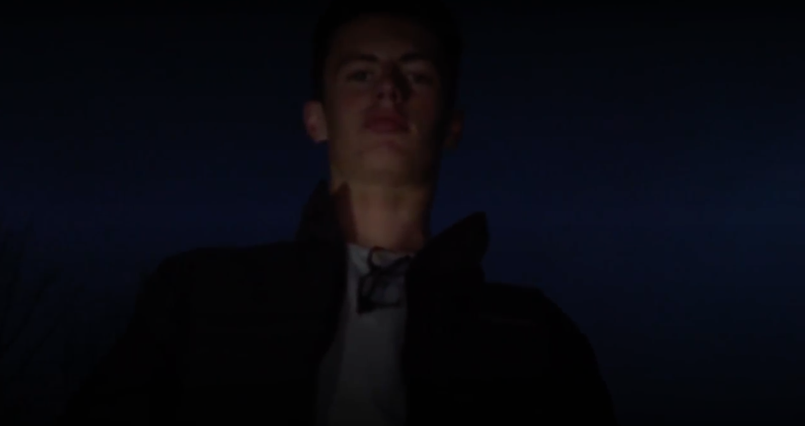
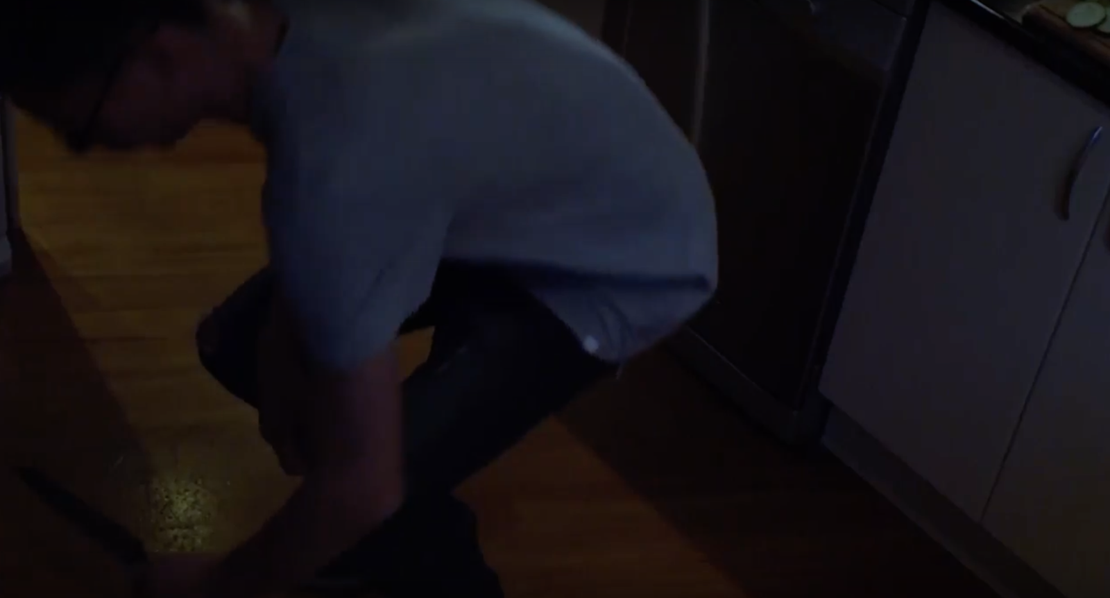 After watching a variety of thriller films there were many different techniques Brooke and I have been inspired by. I particularly enjoyed the opening sequence of the film ‘Gone Girl’. There was an effect overlay that covered the entire movie. It was faded and pale, it created a very cold atmosphere. The flashback sequence will have an overlay that is similar. In many films, there is an altering of colour in post-production that changes the atmosphere of the film. After watching clips of the Psychological Thriller ‘The Machinist’, I noticed that the characters were often dressed very plainly. This is why our characters are to have plain costumes. No prints or patterns. Instead, they will wear plain grey and black. But never white. This is because in many thriller films, white was symbolic of purity which neither character are.
This film will include the following conventions of thriller films:
- Weapon. Thriller films will always have a weapon as they create a sense of danger and ambiguity in the audience. Our weapon of choice was is a knife. Knives represent danger and uncertainty and in our case, it is used to represent a ‘cut’ between sane and insanity of our main character, Kieran, who we eventually see growing tired of his girlfriend’s anger and mistreatment of him.
Close up shots: These are essential in any thriller film as it is confrontational and will cause them to be pulled into the scene. An example of a close up shot is this one of Madelene.
It is used to create anxiety and dismay as she is confronted by her boyfriend who is now standing over her. The close up shots are going to be used for showing detail and emphasizing certain aspects of the film. E.g reactions, emotions- Gender Roles - In many thriller films, we have a dominant male lead. Michelle Rodriguez a Hollywood actress has explained that the ‘masculine’ alpha male is becoming extinct and we tend to agree. This is why we chose to create a male lead who was a little on the geeky side. Kieran wears glasses and in the beginning of the film, acts a little off. His nerd like persona means audience members who aren’t exactly the most athletic or popular can align with him. The way he is controlled and bossed around by his girlfriend will be relatable to some. Many believe that the male has the dominant role in a relationship. They’re the one with authority and Kieran begins as the weakest link. After all the emotional abuse, his feelings seem to change and instead of removing himself he flips the tables and the emotional abuse he heads becomes physically and he throws it back at her.
- Night Setting with low key lighting: Most thriller films are filmed at night or are for the most part. The darkness is a representative of lurking fair and uncertainty which was key for our film. In one way, it refers to the encompassing darkness that surrounds the doomed relationship.
Another reason the darkness will be relative in our film is because it is an external representative of the darkness that is inside Kieran.
- Open setting: The open setting in the middle sequence will subvert from the typical opening sequences of thriller films. Most thriller openings will show confinement and lack of space which shows a character having a direct fate. They will often be in cities, dense forests and/or places where action can take place. However, we will use an open area - a flat field. This is to leave the characters with nowhere to run or hide but also to show that though their relationship is very open, there is hardly anywhere for them to go without each other. This leaves the audience in a state of ambiguity as they will never see what is beyond the open field.
- Jump Cuts: In a majority of thriller films, the antagonist of the film is often only seen for a few seconds. Each shot is quick with no significant transition. We will use these cuts to hide their identities for later on in the film. In the eyes of the audience, there is conflict between who the antagonist and protagonist is in our film. The switching of roles will be significant to the plot and wanting to play with the theme of identity. There will be a number of jump cuts in our film but both characters are almost always in plain view.
- High and low angle shots: High angle shots are used to make objects seem small. In the beginning of the sequence, Kieran will be seen in a series of high angle shots. The best example of this is when he is actually on the ground to grab the knife he dropped. Low angle shots are used to show power and this will be seen as Kieran and Madalene switch roles and Kieran ends up towering over Madalene as she lays helpless on the ground.
After watching a variety of thriller films there were many different techniques Brooke and I have been inspired by. I particularly enjoyed the opening sequence of the film ‘Gone Girl’. There was an effect overlay that covered the entire movie. It was faded and pale, it created a very cold atmosphere. The flashback sequence will have an overlay that is similar. In many films, there is an altering of colour in post-production that changes the atmosphere of the film. After watching clips of the Psychological Thriller ‘The Machinist’, I noticed that the characters were often dressed very plainly. This is why our characters are to have plain costumes. No prints or patterns. Instead, they will wear plain grey and black. But never white. This is because in many thriller films, white was symbolic of purity which neither character are.
Another thriller film we’ve been influenced by is ‘Vertigo’. Something Brooke and I liked from this film, was the open setting. There is at one point an open field that Scottie and Madeline meet in before she runs into the church. The female character had direction and the male followed her. The reason Scottie seems to be going insane is because of the way he has been treated by Madeline. We intend to bring this into our film. The woman’s actions taking a toll on our male character.
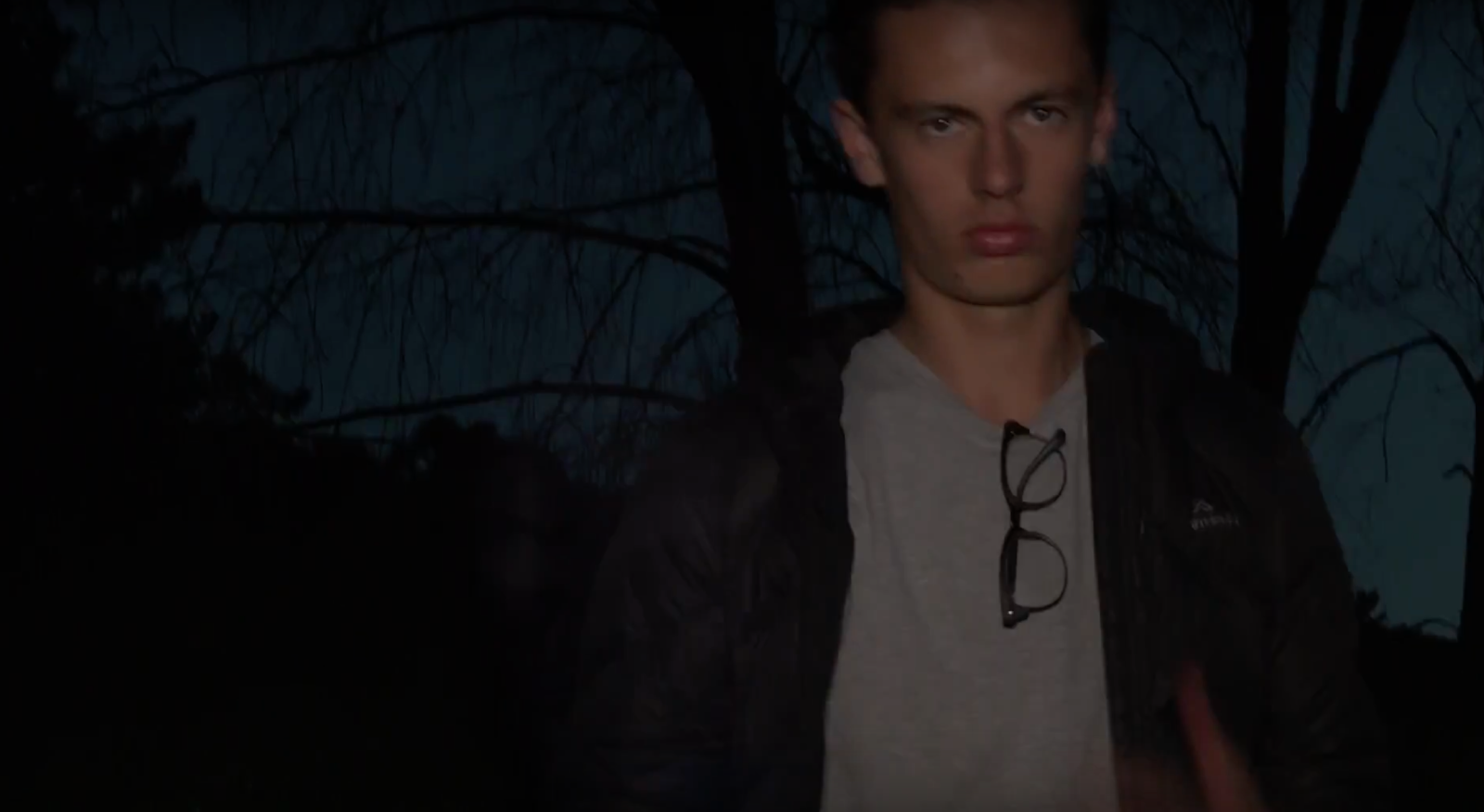 Symbolism: One of the most important symbols in our film will be the knife. Recognised in thriller films as a weapon and sign of danger, the knife will show how Kieran will eventually become someone the audience and Madalene should be scared of. Though he begins using it because he is doing something domestic like chopping vegetables, the role reversal of the male cooking is important and Madalene’s assertive control that is shown by her voice will prove to be no match for Kieran. The fact that he is in control of the knife foreshadows its importance in the future of the film.
Ideology: The main message of our film is that abusive relationships are not necessarily men taking charge. Today, when the idea of an abusive relationship is presented many will immediately jump to the conclusion it is the male figure at fault. In our film, we want to show audiences that this is not always the case and though it may result in the male becoming physically violent, emotional abuse is just as bad as physical. Our audiences are put into a conflicting position. Who is really at fault? Though Madalene seems to pay no attention to Kieran unless he is doing something that causes her to be put out of place, Madalene ends up being the one in grave danger. Her emotional abuse toward her boyfriend may well be the reason he snapped and became someone new. At first, the audience will want to align with Kieran because he is the one being looked down on. However, they may change who they side with when Kieran’s abusive side is shown. Seeing as this is only the first 2 minutes of the film, the audience cannot strongly align with either character as their true colours are revealed - Kieran’s just comes a little after Madelene’s.
Mood and Tone: Throughout our film we want our audience to feel uncertain about the results. It is slow in the beginning, to set an atmosphere of homeliness. We want there to be a certain sense of domesticated life. Madalene and Kieran are obviously living together however the tension in the kitchen area will be obvious. Tension is necessary to produce a film that leaves an audience on edge and at times, make them cringe. I believe by having no music in the beginning will create a few awkward silences that show how closed off from each other the couple is. The only time the silence will be broken is when Madalene either yells at Kieran or when Kieran seems to mess up. This changes toward the end of this scene as Kieran raises his voice at Madelene. This is where there will be a shift in atmosphere, Kieran’s dominant side is about to be seen and music begins showing what could be a 180 degree change in Kieran’s character.
Themes and Motifs: One of the major themes we are going for is identity. Madalene’s identity stays consistent however, her dominance is tested with the identity switching of Kieran. Our male lead, Kieran is your typical anti-masculine alpha male. As Hollywood actress Michelle Rodriguez puts it, the masculine alpha male is a dying trend. Kieran is an example of this. “Hello geek.” Says Rodriguez. His identity in some way lies in the glasses he wears. Glasses often represent intelligence and geeks. We will have him remove his glasses and this will be a tipping point for Kieran. His expression and demeanor will change and rather than run to help his girlfriend, he will lurch forward to hurt her.
Another theme we want to portray is relationships. Far from a romance movie, incorporating the romance aspect of film into our project, we want to show how abusive relationships can be. Madalene being emotionally abusive toward her boyfriend isn’t very common. It is often seen that the male is highly dominated over his partner but Madalene’s hoarding of insults toward Kieran shows differently. This broken convention seems to fall slowly back into place as the film progresses, the emotional abuse that Kieran receives is then taken and turned into physical abuse by him toward her.
One motif that we want to use is the colour red. Only subtly though. To us, the colour red represents love, seductiveness and danger. The theorist Laura Mulvey speaks about the male gaze and how women are always presented in a sexual manner. We do not want to do this with Madalene because we don’t believe it will add anything to the film but we do want to take the male gaze into consideration by having having the gaze always aligning to the female character. The colour red is a perfect way to ensure she is noticed. Her red scarf and red nail polish will be used to subtly show that Madalene is seductive and dangerous. There will also be irony as the only danger involving Madalene is the danger she creates for herself by pushing her boyfriend to the edge.
Mise-en-scene/setting: In the kitchen shots, Alexis and I focused on every small detail of the scene. As we were filming in our second location (our school house) we had to take out things to make it look more homely. For example, school certificated and a child's medical report were not apart of the background we wanted for our shots. We analysed each shot to make sure it was exactly how we wanted it -within reason- and made sure each object in the shot suited the shot and helped build it. Outside, we again made sure the setting and the objects and positioning inside the frame made sense to the scene and each object has a specific place. For example, the large rubbish bin and children's playground were excluded from the shot, as these aren't seen in your everyday couple's home.
Symbolism: One of the most important symbols in our film will be the knife. Recognised in thriller films as a weapon and sign of danger, the knife will show how Kieran will eventually become someone the audience and Madalene should be scared of. Though he begins using it because he is doing something domestic like chopping vegetables, the role reversal of the male cooking is important and Madalene’s assertive control that is shown by her voice will prove to be no match for Kieran. The fact that he is in control of the knife foreshadows its importance in the future of the film.
Another symbol that is going to hold a great significance are the glasses that Kieran wears. Through the early part of the sequence, Kieran is wearing glasses. This will be to tie in with the idea of him being the weakest link. He can’t see without his glasses but the world would be an entirely new place if he has no glasses on. Eventually, Kieran will pull his glasses off and what looks like his true self is revealed. His expression changes and he becomes much darker. Then the sequence shows what looks like him pushing Madalene over but.. The audience won’t be entirely sure yet.
Sound and Music: In the early part of the sequence, there will be a lot of diegetic sound. The most significant will be the sound of Kieran cutting. The cutting noise is going to be what upsets Madalene and leads to her going off at him. This will create a chain of events that flip Madalene and Kieran’s lives upside down. The main source of sound in the early part of the film is going to be dialogue between the two characters, a majority of which will belong Madalene. Again, showing that she is the voice of the relationship. Any lines belonging to Kieran will be short and apologetic which changes in the next scene. The middle section of our sequence is to be dominated by non-diegetic voice over belonging to Kieran. This is contrasts with the dialogue he had in the first scene. The reason he has dialogue here will be to show the audience that though he is quiet on the outside, on the inside his thoughts are constantly racing as he thinks about all the ways his girlfriend seems to despise. The music we will use is suspense building and will help to create the desired atmosphere of danger and uncertainty. In many thriller films, soundtracks will often start off somber and grow into something much more intense. This is what we plan to do with the music tracks chosen for our film.
Editing: In the post-production phase the shots will be arranged to include a number of jump cuts. The jump cuts are important as they set the pace for the film. There are no major transitions in the first part of the film, the fast paced jump cuts come in the latter third of the sequence. This is the daydream sequence in which we will repeat events that as just happened to get an idea of what really went on. We intend to create a clip where there is a shadow on the wall and while Kieran continues to cut. In the editing phase, we will have to crop and overlay one clip while the other continues to play. The two shots will show a separation of two sides of Kieran, the domestic ‘housewife’ side and his dark side that comes from within. During the dream sequence, I also intend to add a colour overlay to ensure the audience knows the shots are a repeat/flashback of the past. The overlay will more than likely take some colour and clarity away from the film which goes along with Kieran removing his glasses, taking away his clarity and reason.
Thursday, 21 July 2016
Contribution to the Concept:
Half-Hearted:
Title: There was a huge verbal brainstorm as we searched for titles for our film. We wanted to find something that related to the cold nature of the relationship between our two main characters. We also wanted a title that related in some way to love or lack of love. Other words that came up included: Irresolution, Doubt, Two-Faced, Unfaithful
Half-Hearted seemed the most appropriate because it would cover many of the themes our movie would incorporate as a whole. Neither Madalene nor Kieran loved the other whole-heartedly as one of them always seemed to be putting the other down. For Madalene, power was exerted through emotional abuse while Kieran, though made out to be weak, eventually exerts his power through physical action and it shows in his mental state. The word half-hearted means having or showing little enthusiasm. We want to create a tense atmosphere in our film that shows neither party is really fully into the relationship.
Conventions:
- Weapon: Our weapon of choice is a knife. Knifes represent danger and uncertainty and in our case it will also represent a certain ‘cut’ between sane and insane of our main character, Michael.
- Close up shots: Used for showing detail and emphasizing certain aspects of the film. e.g reactions, emotions - fear and anger, knife
- Gender roles - Who’s more dominant?: Our male lead will start off as the ‘weakest link’. Bossed around by his girlfriend, he is made to feel small. She abuses him emotionally and being fed up, he turns the abuse to physical.
- Night setting and low key lighting: Most thriller films are filmed in dark settings. We decided to have our film set during the night to emphasizes a type of lurking darkness. In one way, it refers not only to the encompassing darkness surrounding the two ‘lovers’ but the darkness that is building up inside Michael, our male lead.
- Monologue: Many thriller openings incorporate diegetic sound in the form of a voice over. It is usually separate from the story. A narration or back story of what is happened. We have decided to use it in the form of an internal monologue. We wanted to create a certain vibe that alludes to the insanity of Michael.
- Open setting: Our open setting in the middle of our sequence diverts from the typical opening sequences of thriller films. A lot of the time, thriller film openings will show confinement and lack of space as if the character has no other options. Ours instead is in an open space which will leave our audience in a state of ambiguity.
- Quick cuts: In a majority of Thriller films, the antagonist of the fim is often only seen for a few seconds and is separated with quick cuts. This is in attempt to hide their identities for later in the film. Our sequence will divert this convention as both our protagonist and antagonist switch roles in the eyes of the audience and both are almost always in plain view.
- High and low angle shots: High angle shots are used to make the object seem small. In the beginning of the sequence, we will have Michael in a series of high angle shots to make him look small and our final shot will be a low angle shot of him He will grow to become an overbearing tower.
Prop List
- Knife
- Tomatoes
- Cucumber
- Chopping Board
- Nail polish bottle - top coat/water
- Glasses - that can be broken
- Plasters
Practicalities of Filming
Our idea is realistic in the sense that any relationship can have issues and sometimes the depth to which they extend is not externally visible until one of them snaps. Our film won’t include any out of the ordinary locations and have been scouted prior to filming to ensure our vision is realistic.
We will be filming at a classmate's house and a field/forest area that is behind the house.
During the scene where Michael is in the kitchen, he uses a knife. This is a health and safety issue because Michael has to cut vegetables and may cut himself. Another safety issue that we will face is during the shots filmed in the forest/field. There are a few holes in the ground that could be dangerous to the talent and we will ensure they are informed beforehand that they should tread carefully when walking through.
Our interior lighting will be ambient. The kitchen lights are helpful and put just enough light on the subject that we are filming. We took practice shots prior to filming to ensure our lighting would work on the filming day.
Our exterior lighting will be a little more difficult as we are filming at night. We have decided to use an LED camera attachment. We have chosen to use this light because any stronger lights would seem much too artificial. The LED is going to be fastened above the camera to keep it still and constant.
We also want to use a shoulder mount for specific shots. The shoulder mount will be helpful for steady shots as we follow Michael and Madeline through the kitchen as well as while they follow her through the field.
For Saturday there is a percentage chance of rain. We will definitely film our inside shots on time but the outside shots will be very weather dependant. If it rains too hard, we will not film but if there is little rain we will put a plastic bag over the camera and carry it under an umbrella. If Saturday night filming is cancelled, we will move the shooting to a Monday afternoon where there is a smaller percentage chance of rain.
Sunday, 8 May 2016
Preliminary Task 2 - Creative Critical Reflection
Atychiphobia - Final Cut
Creative Critical Reflection




Saturday, 7 May 2016
Logo Investigation
1. Warner Bros Pictures
What did it used to be, what is it now, why did they use it and why did they change it and what has it come to symbolise
Though the Warner Bros logo has varied over time, there is one consistent object that it is based around and that is a shield. The original logo has transitioned through a multitude of logos. There are 13 main logos as well as 200+ variations of these logos that were customised to reflect the theme of the film.
In 1923, Warner Brothers released a film with their first logo. It was nicknamed the 'Brain Shield' and the top half of the shield included a photograph of the exterior of the Warner Brother's studio that is located in Burbank, California. The bottom half was inclusive of the famous W-B initials. The shield was never given a solid meaning, however I feel like it could be symbolic of Warner Brothers showing their strength and how they are determined to thrive in the film industry. The shield is a symbol of protection meaning no other companies could takeover.
In 1929, sound was introduced to film and to show
 that their films were now accompanied by sound Warner Brother's partnered with Vitaphone and created a logo that acknowledged them. They still included the shield but it had evolved. The shield no longer contained the image of the studio and instead, the WB initials completely occupied the space of the shield. The shield stayed centred in the logo and more words were added for audiences to also acknowledge Vitaphone.


2. Dreamworks
Many film companies have started from humble beginnings and grown into something great. DreamWorks however, was created by many great names in the film industry which resulted in sucess from the start. In 1994, Steven Spielberg, Jeffrey Katzenberg and David Geffen came together to create the company known as DreamWorks. One of the main reasons for DreamWorks' success is the logo that is globally recognised as belonging to them. Both Spielberg and Katzenberg are creative with their sense of animation. Katzenberg is chairman for Disney while Spielberg has created films such as E.T, Jaws and Jurassic Park.

 In 1995, the logo was recreated to involve some clouds. It was then known as the 'Cloud Cover' The clouds added a nostalgic and idyllic effect to the logo while the child fishing on the moon was effective in speaking to the inner child in everyone. The logo was a representative of DreamWorks' films, they were created as something not confined to one place but instead they would create fairy tale films that took place in foreign places.
Shown below is the most recent 2016 DreamWorks logo. As anyone can see, it has brightened up and become a lot more colourful. Again, it shows the idyllic boy on the moon in the centre of the screen and this has not and most likely will not change for a long time. The bold words however have been changed and this time are not blue but an array of different colours. This targets children as it shows their company as playful and child orientated. Each letter is given a different colour that makes the logo stand out from the blue and white background.

 The first logo is rumoured to have been doodled on a napkin in 1914. It was a drawing of a star-crested mountain. The now famous 'Magic Mountain' is an idealised picture of Ben Lomand Mountain in Utah. The mountain is said to have held a great significance to William Wadsworth Hodkinson, the creator of Paramount Pictures, as the mountain he remembers seeing as a child. The image of a mountain is is strong. It alludes to a certain empowerment and confidence. Considering Paramount has been around for over a century, it is the perfect image for the worlds second largest film company.
 In 1952, the second logo was redesigned as a matte painting done by the studios head painter, Jan Domela. They changed to this logo from the ones created by film techniques because they believed it was time for a change. The 24 stars surrounding the mountain are just as significant as the mountain itself. They represented the amount of actors and actresses working for Paramount Pictures at the time. Depending on the amount of actors signed to work with Paramount, the stars would either grow or shrink in size.

What did it used to be, what is it now, why did they use it and why did they change it and what has it come to symbolise
Though the Warner Bros logo has varied over time, there is one consistent object that it is based around and that is a shield. The original logo has transitioned through a multitude of logos. There are 13 main logos as well as 200+ variations of these logos that were customised to reflect the theme of the film.
 |
| Above: Warner Brothers Logo 1923 |
In 1929, sound was introduced to film and to show
 that their films were now accompanied by sound Warner Brother's partnered with Vitaphone and created a logo that acknowledged them. They still included the shield but it had evolved. The shield no longer contained the image of the studio and instead, the WB initials completely occupied the space of the shield. The shield stayed centred in the logo and more words were added for audiences to also acknowledge Vitaphone.
The first appearance of colour in the Warner Brother's logo occurred around 1940. The famous blend of red and blue hues is accompanied by a shining gold shield that is a reflection of the companies characteristics. It represents wealth, authority and power. Warner Brother's is on of the oldest and most influential American production companies behind Paramount Pictures and Universal Studios.

Though there are many variations of the Warner Brothers logo, there are three main variations that have affected the main idea of the logo. These came as results of changes in ownerships or partnerships that Warner Brothers have undergone.
The first change of ownership that affected the logo happened in 1969 as a result of Jack L. Warner selling his controlling interest of the company to Seven Arts Productions. For the first time since the establishment of Warner Brothers, the famous WB initials were no where to be seen. Instead there was a W7 in the centre of the shield that represented the merge between Warner Brothers and Seven Arts.

Two years later, the company was brought by Kinney National Company who thought it would be a good decision to remove 'Seven Arts' from the companies name and return the logo to its original state. They wanted the logo to resemble something of a gas station sign. The letters were gold and encrusted on a crimson shield. They added their company name on a strip placed on the lower half of the shield. All this was done in an attempt to divert from the historical record of the logo.

In 1972, Saul Bass was hired to revamp Warner Brothers company. Known for his graphic design, Bass produced the above logo. To many people of the 80's this logo was actually compared to the a Nazi like design and was disapproved of by many. However, this logo is used for a few modern day films such as Magic Mike and 'Argo'.
 The 2016 logo is a combination of old logos mixed into one. the basic idea of the shield has been kept constant as well as the red, blue and gold theme. The Warner Brothers initials are still the main parts of the logo and the band that contains the film companies title is centred on the shield. This is similar to the Kinney National companies idea of having their name on a band in the lower half of the shield. The distinctive logo is globally recognised due to its colour and unchangeable inclusion of a shield.
 2. Dreamworks
Many film companies have started from humble beginnings and grown into something great. DreamWorks however, was created by many great names in the film industry which resulted in sucess from the start. In 1994, Steven Spielberg, Jeffrey Katzenberg and David Geffen came together to create the company known as DreamWorks. One of the main reasons for DreamWorks' success is the logo that is globally recognised as belonging to them. Both Spielberg and Katzenberg are creative with their sense of animation. Katzenberg is chairman for Disney while Spielberg has created films such as E.T, Jaws and Jurassic Park.
 |
| Robert Hunt with his son. |
The 'Boy on the Moon' logo was first pitched by Steven Spielberg. He had wanted to create a logo that could capture the essence of Hollywoods 'Golden Age'. At first, Spielberg had wanted to make the image computer generated but they ended up commissioning artist Robert Hunt to hand draw the image. Originally, Spielberg had wanted to use a man sitting on a crescent moon but after Hunt used his son as a model, all three of the moguls came to the conclusion that it would be better to have the man become a boy.
 In 1995, the logo was recreated to involve some clouds. It was then known as the 'Cloud Cover' The clouds added a nostalgic and idyllic effect to the logo while the child fishing on the moon was effective in speaking to the inner child in everyone. The logo was a representative of DreamWorks' films, they were created as something not confined to one place but instead they would create fairy tale films that took place in foreign places.
Shown below is the most recent 2016 DreamWorks logo. As anyone can see, it has brightened up and become a lot more colourful. Again, it shows the idyllic boy on the moon in the centre of the screen and this has not and most likely will not change for a long time. The bold words however have been changed and this time are not blue but an array of different colours. This targets children as it shows their company as playful and child orientated. Each letter is given a different colour that makes the logo stand out from the blue and white background.

3. Paramount Pictures
Paramount Pictures was first established in 1912. It started off small and has since then grown to become one of the most influential film companies to date. Paramount Pictures has become globally recognisable due to its distinctive mountain range poking through a bed of clouds. Brand recognition is important for any company and for audiences who watch any film created by Paramount Pictures, the logo is an important part of the film. It is not often that Paramount will change any aspect of their logo to relate to certain film themes but there are some cases in which this will happen.
The first logo is rumoured to have been doodled on a napkin in 1914. It was a drawing of a star-crested mountain. The now famous 'Magic Mountain' is an idealised picture of Ben Lomand Mountain in Utah. The mountain is said to have held a great significance to William Wadsworth Hodkinson, the creator of Paramount Pictures, as the mountain he remembers seeing as a child. The image of a mountain is is strong. It alludes to a certain empowerment and confidence. Considering Paramount has been around for over a century, it is the perfect image for the worlds second largest film company. In 1952, the second logo was redesigned as a matte painting done by the studios head painter, Jan Domela. They changed to this logo from the ones created by film techniques because they believed it was time for a change. The 24 stars surrounding the mountain are just as significant as the mountain itself. They represented the amount of actors and actresses working for Paramount Pictures at the time. Depending on the amount of actors signed to work with Paramount, the stars would either grow or shrink in size.
The third recreation of the logo was created in 1987 and since then, there have been no drastic changes. Again, the format of the image changed and was created as a computer generated image as opposed to the previous matte painting. With technology improving, they were able to create an image with much better graphics as they were introduced to animation.
The stars had previously remained static but now would appear to fly toward the mountain before settling in their original position. This is done so that the focus is then on the mountain's peek - a symbol of strength and power.
The Importance of a Film Logo:
From this investigation what I've learnt is that there is a certain importance to having the main elements of your logo in the centre of the screen. It means that all attention is focussed on the image in the middle. If the image is simple then it will eventually become recognisable. For a lot of the film companies it isn't that they are easy to remember but more so that they have been around for generations to see and people have grown up just knowing which film is made by which company. All of the logos have the name of their company, although they could just leave this out as they have distinctive images that present the logo, their names are always clearly and boldly presented either directly above, beneath or centred on the main image. They also have one specific logo that has been constant since the companies logo was created and any attempt to alter this has resulted in its return.
Subscribe to:
Posts (Atom)